Which Size Artwork Should You Select?
Read Time:7 Minute, 12 Second
You have just discovered a work of art that you really enjoy… and then you put it on the wall and everything seems mismatched. It is too small over the couch, or it is far too big in that little hall. Sound familiar?
The appropriate size of artwork will determine whether a room looks pulled together or somewhat clumsy, despite the rest of the room being beautiful. The good thing is, you do not need an interior designer to do it; you need only a few simple tips.
In this guide, we are going to take a step-by-step tour on how to choose artwork that not only fits in your space but also looks purposeful and fits your taste.
Begin with the wall, not with the work of art.
The majority of people do this in reverse. They fall in love with something and then attempt to make it fit somewhere. It is better to begin with your walls and furniture:
- Is it a big, open wall or a little in-between space?
- Is there any furniture placed there, such as a sofa, console, or bed headboard?
- How high are the ceilings?
It is possible to reduce the number of sizes that will feel natural once you understand what type of wall you are dealing with.
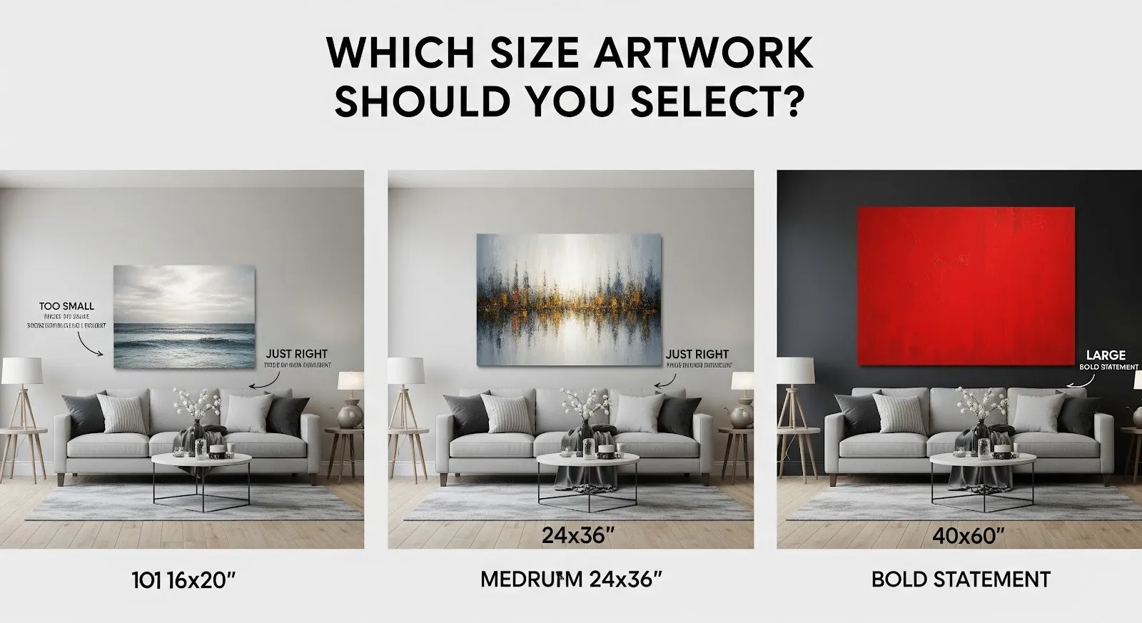
One simple rule of thumb: Artwork tends to be most attractive when it covers approximately two-thirds to three-quarters of the wall area above a piece of furniture. You are not guessing, but dealing with a proportion that tends to be right.
Measure once, regret never
Before shopping (or printing anything), take a tape measure and make a note of:
- The width of the wall
- The height of the wall
- The size of any furniture the piece of art will be placed over
Then, do a bit of simple maths. As an example, suppose that your sofa is 210 cm wide:
- Two-thirds of that is about 140 cm
- Three-quarters is about 160 cm
Ideally, you would like to have your art (or collection of art pieces) 140-160 cm wide all the way across. This does not imply that it has to be a single large piece; it might also consist of two or three pieces joined to achieve the same width.
In case you prefer to visualise, place painter’s tape or paper cut-outs onto the wall to outline various sizes. It is a no-pressure method of trying out what looks good before you commit.
Selection of sizes for various rooms
Artwork performs numerous visual roles in different rooms. Awareness of the role the art will play will assist you in choosing the appropriate size.
Living room
Your largest statement piece is likely to be found in the living room.
- If there is a place above the sofa: Have a work (or ensemble) approximately two-thirds the width of the sofa. Also, hang it in such a way that the centre of the painting is approximately at eye level (say, at a level of 145-155 cm above the floor in most residences).
- Big walls: On a big blank wall, a big single piece or a grid/gallery can be used. Simply do not have too many small pieces scattered about; they are very likely to appear dotted and insignificant.
This is where one can afford to be bold in colour and size. The big wall art prints on the walls may serve as the accent of the entire room and make everything seem more purposeful.
Bedroom
Bedroom art should be less dramatic and more serene.
- Over the bed: Observe the same rule of two-thirds regarding the width of your bed. Two medium frames placed next to each other can be very effective in case a big piece seems too dominant.
- Opposite the bed: You will spend most of your time facing this wall, which is why it is the best place to have a medium-large artwork that is relaxing.
Make the scale generous, but not as much as the living room—think relaxing, not flashy.
Dining room
Art in the dining room normally battles with other points of interest, such as lighting or a beautiful table.
- Over a buffet or console: Once again, a two-thirds to three-quarter width of the furniture is ideal.
- On an empty wall: A single, big, and restful piece is classier than many small ones that do not match.
It makes more sense when it is a gallery wall
Nevertheless, a large single piece might not be the solution in some cases, particularly when you are fond of combining photographs, prints, and typography.
A gallery wall is ideal when:
- You possess a big wall and smaller art pieces.
- You desire to narrate a story (family photos, traveling memories).
- You prefer a personal, curated appearance.
To avoid a chaotic effect, consider the gallery as a single large shape. Take the total area that you wish to fill (once more, you should target two-thirds of the width of the furniture or wall area), and place your pieces inside that imaginary square or rectangle.
Spacing between frames should be regular (usually 4-8 cm) to make it intentional. The size of individual pieces is not as crucial to the eye compared to the overall footprint.
Think in percentages, not dimensions
Two pieces may have the same width but create a big difference due to their proportions. For instance, a tall, narrow piece will look entirely different from a wide, panoramic one, although they might share the same width.
Some quick tips:
- Long and slender works of art can be placed well in corridors, along door frames, or window frames.
- Large and horizontal pieces suit best in front of sofas, beds, and buffets.
- Square pieces are universal and appear beautiful on their own or in the form of a grid.
When you are in doubt, draw on the wall or trace out approximate shapes of rectangles to determine what percentage seems most comfortable.
Don’t forget the frame
Whether it is the artwork or the manner in which you complete and present it, size is not merely a factor of the canvas itself.
A large mat and a thick frame are able to make a small piece look very big and significant. Conversely, a thin frame with no mat keeps it minimal and tiny, which can be ideal in contemporary spaces or walls that are already full.
In planning a framed print, considerations include:
- The visual weight: Bolder statements are made using heavier frames and mats.
- The decoration around it: Avoid heavy frames in ultra-minimal rooms.
- The grouping: In the case of pieces to be hung together, the frame size or style should be visually coordinated such that they appear as a collection.
Do not forget to include the frame size in the measurements—the frame is the working surface of your art.
Examples of common sizing errors (and their prevention)
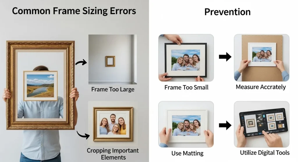
There are several slip-ups that reoccur time and again. Avoid these, and you are already ahead of the game.
- Going too small: The number one issue. Small art becomes lost on a large wall and creates an unfinished space. In case of doubt, it is better to increase the size of an item or combine items to make the footprint visually larger.
- Hanging too high: Art that is floating high above the furniture or sitting too closely to the ceiling looks detached. Keep the bottom of the picture 15-25 cm above the top of your sofa or console, and ensure the center is at eye-level on standalone walls.
- Ignoring the furniture below: Think of the art and furniture as a team. If the furniture is short and long, one small picture in the middle of it will always look out of place.
- Excessive empty space on both sides: Having a broad wall and one medium-sized frame in the center can make the art appear smaller than it is. Occupy more of the breadth, or change to a gallery formation.
Are you prepared to size your next piece with confidence?
There is no need to guess about the choice of artwork sizes that fit your space. Begin with your wall and furniture, employ plain proportions, consider the way the room works, and keep in mind that you can always add a layer of impact by using pairs, sets, or a carefully planned gallery.
Armed with a tape measure, some painter’s tape, and these instructions, you will be able to select pieces that appear made to fit in your house, not stuck in where there was space.
Happy
0 %
Sad
0 %
Excited
0 %
Sleepy
0 %
Angry
0 %
Surprise
0 %


